
You finish the book, you don’t want it to be over with, there’s still one more printed page, so you read it. “A Note on the Type,” it says, and heads off into the highest weeds: the name of the font in which the book is printed, then the font’s forebears, its continuing history, its inventor, its inventor’s history, and sometimes its virtues. This is blindingly irrelevant, unsatisfying, and irritating, and so on purpose I never read it.
Until the book I just finished, Imogen Gower’s The Mermaid and Mrs. Hancock, when I hit the “Note on the Type” page and kept on reading:
This book is set in Caslon, a typeface named after Willliam Caslon (1692-1766).
Aaaand it just goes on from there, the better part of a page. The voice was slightly prissy and assumed I wanted to know a great deal about the William Caslon and his adventures in, as it said, “typefounding.” Caslon founded a family of typefounders but before that, he was apprenticed to an engraver of gunlocks (and of course gun barrels too) in London, then opened his own shop for silver chasing. I don’t know the meanings of: typefounding, gunlock, silver chasing, and a part I left out, bookbinders’ stamps. Caslon’s skill in cutting letters – I don’t know what that is either – attracted two printers whose names I’ll furnish if you need me to and who backed him to buy typefounding equipment. The fonts Caslon cut for a folio edition of John Selden – of whom I’ve never heard – “excited great interest” and thereafter Caslon just went from strength to strength. His font has many virtues, each ennumerated, and its “general effect is clear and open but not weak or delicate.”
WHY is this interesting? WHY? And who thinks I want to know? And who in the name of the sweet baby Jesus writes these things?
I google, I read Wikipedia on typeface: roman is regular and italic is italic, and they’re called that because Italy is somehow involved here? The names of the fonts are a delight and a seduction (see link) but typeface and font are not quite the same thing and oh God oh God a thick fogbank moves over my brain, I can read no farther.
Peter Ackroyd’s Casebook of Victor Frankenstein, 2008: set in Legacy Serif, created by Ronald Arnholm, inspired by Venetian Old Style fonts by Nicolas Jensen, initially designed to imitate the handwriting of Italian Renaissance scholars but “still serves their function well today.”
I don’t know what “old style” fonts are either, but maybe that Italian Renaissance handwriting is why fonts are roman or italic? Sure, why not.
Back to “Note On the Type”: apparently that page is a kind of colophon, a sort of “this is my name and I wrote this” at the ends of ancient manuscripts which with the invention of printing became, for instance, “this is who printed this book and when,” though Wikipedia notes that sometimes colophons were images and sometimes even curses and I am not, not, not going to look that up. No.
George Saunders, Lincoln in the Bardo, 2017: set in Fournier, named for Pierre-Simon Fournier, youngest son of a French printing family, said to have created and cut 147 alphabets, best known as the designer of St. Augustine Ordinaire.
Googling turns out to be no help – one of those deals where the answer is probably buried in the back room of an article about something distantly related and I’m already forgetting the question.
Hermione Lee, Penelope Fitzgerald, 2012: set in Adobe Garamond, based on types first cut by Claude Garamond (c. 1480-1561), who was a pupil of Geoffroy Tory and who created the “old style” types which have “a certain elegance and feeling of movement.”
I’m not going to look up “old style,” I don’t care, it’ll just have to content itself with being peripheral to my life. Part of the answer to the question of WTF these pages are can be pulled from the pages themselves, which by the way are not boilerplate, they’re written specially and even their titles are different. The original inventors of typefaces seem to be French, English, Dutch, or Italian, specifically Venetian. Their types were modified, improved on, subtracted from, added to. Typefaces were invented with, of course, the invention of printing — though that can’t be quite true, those medieval scribes did some pretty fancy fonts. Anyway, that’s about it.
Julian Barnes, The Sense of an Ending, 2011: set in a version of Monotype face Bembo, cut by Francesco Griffo and first used in Pietro Cardinal Bembo’s De Aetna of 1495. The companion italic is an adaptation of chancery script type designed by Lodivico degli Arringhi [which I thought was Italian for “herring” but turns out to be “harangue.”]
I’ll stop wandering around pointing out rabbit holes now. I still don’t know why these pages are written, why what started as a colophon is still being done – don’t historical artifacts die out on their own? I don’t know who writes them – the printer, maybe? And what about a given type conveys a “feeling of movement,” or an effect that is “not weak or delicate?”
But I’m morally certain, with no evidence whatever, that somewhere on the internet is a devoted band of typefounders who can explain every nuance of these “Note on the Type” pages. I might regret this, but I hope they write in.
_______
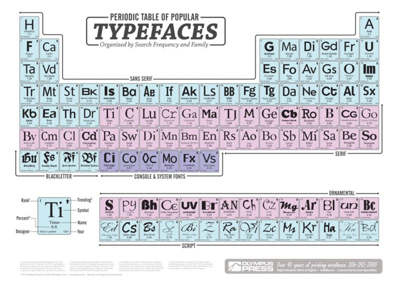
Photos: I’m pretty sure this is one of the devoted bands of typefounders and if it’s not, it should be, by Juuso Järvi ; the brilliant Periodic Table of Typefaces is by Jeremiah easter , via Wikimedia Commons, here if you want to blow it up. You’d be able to see the inventors and year of invention.
I don’t understand the placement of that information either. But I almost always read it for the same reason that I read my cereal boxes. Regarding typeface, there is a charming show about a designer on Netflix. The show is: Abstract: the art of design. The episode is: Jonathan Hoefler: typeface. His wonder and excitement is a joy to watch.
Huh. I read mostly old mystery (e.g. Sayers), sci-fi, & fantasy with a smattering of children’s lit. I don’t recall seeing these pages at the end, and I’m one of those guys who reads the copyright page in the front. (Is that the “frontispiece”?) Maybe you have to be so-called Literature (capital required) to have font notes?
I had a similar thought — maybe these pages are in fiction and not non-fiction, or hardbacks and not paperbacks, or older books and not newer books. None of those is true. I do hope some typefounders turn up in the comments.
Bizarrely interesting…
Ann! Dr. D! Someone wrote a whole book about your rabbit hole! Mr. Penumbra’s 24 Hour Bookstore, by Robin Sloan. It’s from 2012 so a bit too sanguine about tech but the adventure bit is brilliant.
Thank you Sally! I shall look into this matter immediately.
Huh is right. I agree with Dr. D I am however sending this piece to my artistic sister who geeks out over fonts. Thank you.
I don’t know how to convey the ethos (pathos?) of finding the right font for the right situation…but you know when you get it right. The easiest way to understand is to look at the font of brands – I suppose. Coca-Cola looks like an English translation of a medicinal home remedy from Central America in this font as I type to you. Gillette’s leans forward as that of a blade…Disney has it’s round playful design of childhood. Attempting to convey that same ‘at-a-glance’ emotion into hundreds of pages – nay, hundreds of thousands of words – in a particular manuscript appealing to the visual impact of the typed word is at the very least tedious. But in that tedium…sitting and creating a visual replication/representation of the emotion in a authors written word is at it’s most profound…is magical. So, yeah, a Note on the Type…a brief nod to an artist’s life’s work who helped convey the story is deservedly so. Current fave: Calibri. 😉
Thank you, Sister! I sort of get it — or rather, I do get what you’re saying about the art of designing fonts. What I still don’t get is who writes those “Notes on the Font” pages and why.
Maybe the use of a particular font requires it? Or denotes a certain quality of the printing…a pedigree of sorts? I really haven’t a clue – never even read a book that had that in it that I am aware of. I would love to have a glass of wine and watch when the creators of The Declaration of Independence decided how how the hell they were going to give this new document an intro of We The People and THAT font choice. Fun read – thanks for the coffee time neuron jump!
Typography — the choice of fonts, the way words are laid out on a page — is a niche but under-appreciated branch of graphic design. For those of us who are really into it, reading “a note on the type” is like watching a behind-the-scenes featurette or listening to the director’s commentary on a movie: certainly not essential, but having someone who’s really good at their craft explain their process will never be boring. I don’t expect everyone to read Simon Garfield’s “Just My Type” (https://www.simongarfield.com/books/just-my-type-us-edition/). But type is just as varied and can be just as expressive as color, and learning to use it well is a powerful skill for visual communication.