I often write about subjects that are hard to read about—climate change, extinction—so I think a lot about how to draw people toward information that mostly makes them want to run away. Musician, artist, and programmer Brian Foo has pondered the same problem, and his solution is simple. Present your readers with terrifying data, then ask them to color it in.
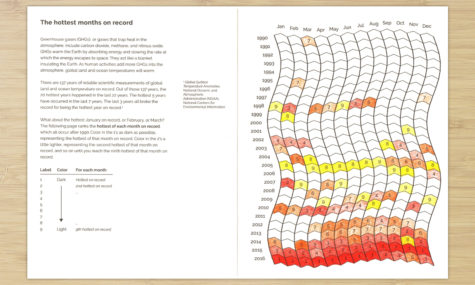
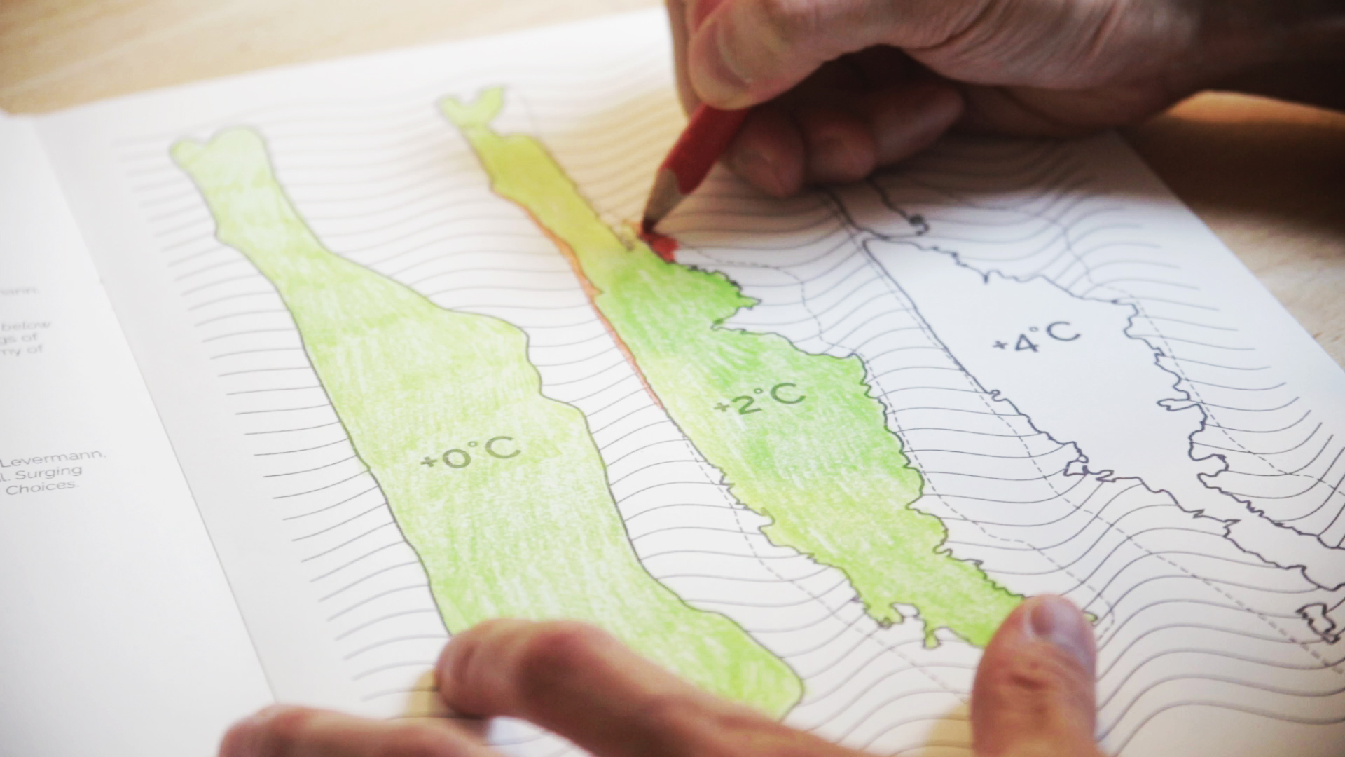
The graphs, maps, and other illustrations in Foo’s new Climate Change Coloring Book are based on data from studies of carbon emissions, shrinking sea ice, and other causes and consequences of climate change. They have a minimalist beauty, but it’s the act of coloring that makes them compelling: the reader becomes a participant, and by doing so, starts to grasp both the scope of the data and the enormity of its implications. I spoke to Foo about his project earlier this week.
So why a coloring book about climate change?
Well, a lot of the work I’ve done with data in the past has involved music—thinking about how music can be a vehicle for communicating patterns in data, and even evoking an emotional response to them. As an artist, it’s interesting for me to think about how can I walk someone though a dataset in a particular way.
I wanted to go back to where I started as an artist, with physical art and physically drawn art, and I also wanted to pursue something that was a little more active for the participants—where they could help produce the data visualization themselves.
Coloring books for adults are a bit of a nostalgic exercise, but I think they’re popular because they give people a moment to reflect or meditate while still doing something active, producing something rather than simply consuming it.
So I was interested in seeing how I could juxtapose data—in particular data that might be a little more urgent and anxiety producing—with a practice that’s associated with reflection. The goal is to try to get the person who’s coloring to take time to think about the underlying issues—not only do they get the information, but hopefully they also think about what the data represents and who will be affected by it.
How did you choose the data?
I did seek data that was publicly available, so if anyone wanted to explore it further they could do that—most of it comes from NASA or NOAA or other government entities that collect data for public use. Part of the goal of project is to encourage data literacy—to walk people through the process of identifying reliable sources, then walk them through the data available from that source.
So who in particular is your audience? Not kids, it sounds like.
(Laughs) Yeah, I tried to make it so that it’s not specifically for kids, or for any age group, really. I did write it so that kids as young as middle school could understand it, especially with some guidance from an adult. The activities themselves have pretty clear instructions, so if you can read and if you have some basic scientific vocabulary—if you know what carbon dioxide is—then you can probably get something out of this book.
What kind of response have you gotten so far? I’ve seen a couple of funny headlines along the lines of Hey! Stress yourself out with this coloring book about climate change!
(Laughs) There are a couple of strains of feedback coming from very different places. People who have used adult coloring books recognize that that it’s kind of a subversion of the form—they’re jolted by the juxtaposition of this usually calming activity with climate change.
The other feedback I’ve gotten is from teachers who say they would like to use it in the classroom, which really wasn’t part of my original intention. I think there’s a couple of trends in education that it fits into—visual and hands-on learning—and I think teachers are also interested in teaching data literacy, not just in connection with climate change but in general. Since data is becoming more and more a part of our lives—our own data is being collected every time we use the Internet—I think there’s this desire to teach kids about data and how to use it, how to draw conclusions from it. I’ve even heard from college-level instructors who have used some part of the book—had their students annotate or color in a graph, just to reinforce particular concepts or issues.
Do you remember an activity or an experience that brought climate change home to you?
Well, I have been learning a lot just through this process. Any of these projects that create art or music through data are research projects in themselves, and I think that actually digging into the scientific process that led to our conclusions about climate change has been a very important experience for me—understanding that these conclusions we sometimes take for granted come from, say, a scientist’s decision to start measuring carbon dioxide concentrations in 1958. I think it’s inspired me to create an experience where someone can almost replicate that original discovery—where they can get a sense of what it’s like to come to a conclusion based on observations.
It’s changed the way I approach information, too—now, whenever I read an article, I try to seek out the source of the statements and find out where the data came from. I think that mentality is important for anyone, of any age, who’s trying to make sense of the world.
Top: a map of sea-level rise around Manhattan under different climate-change scenarios. Bottom: Visual representation of the hottest months on record. Both photos from the Climate Change Coloring Book, courtesy Brian Foo.
