uring my first year at Reed College in Portland, Oregon, I wrote a lot of term papers and played a lot of Tetris on Mac Classics. Squat, sturdy, and pallid, with a postcard-sized monochrome screen, the Classic was three times as heavy as the aluminum-bound MacBook I write on today — with a mere 1/2000 of the memory, poor thing. If anyone ever left it behind in a bar, it was on purpose.
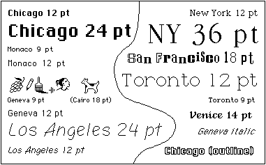
But were my MacBook transported back to the grungy early 90s, I imagine, it would immediately recognize the Classic as its ancestor. The DNA is perhaps expressed most strongly in a few enduring fonts: New York, Monaco, Chicago … you know them, even if you don’t know their names. Even if you’ve never owned an Apple product. In the windowless Reed computer labs, they became a familiar but rarely noticed part of my daily life, as they have been ever since. (Incidentally, if my life were filled with uglier typography, I might have a better memory, as our own Virginia Hughes reported last year.) Little did I know that these archetypal fonts were born, in a sense, in a jam-packed classroom not far from where I sat.
In 2005, during a commencement address at Stanford, Steve Jobs remembered his brief college career. He enrolled at Reed, but quickly dropped out: “After six months, I couldn’t see the value in it,” he said. “I had no idea what I wanted to do with my life and no idea how college was going to help me figure it out. And here I was spending all of the money my parents had saved their entire life.”
He stuck around Portland, sleeping on friends’ floors, returning bottles for deposit nickels, and walking across town once a week for a free meal at the Hare Krishna temple. And he started sneaking back into Reed’s classrooms, sitting in on the courses he thought looked interesting. He remembered:
Reed College at that time offered perhaps the best calligraphy instruction in the country. Throughout the campus every poster, every label on every drawer, was beautifully hand calligraphed. Because I had dropped out and didn’t have to take normal classes, I decided to take a calligraphy class to learn how to do this. I learned about serif and sans serif typefaces, about varying the amount of space between different letter combinations, about what makes great typography great. It was beautiful, historical, artistically subtle in a way that science can’t capture, and I found it fascinating.
Calligraphy? It might sound like a joke about liberal-arts education, like underwater basket weaving (which, during my time at Reed, was occasionally offered as a no-credit class during winter break. Reedies tend to be exhaustingly self-aware.) But the Reed calligraphy class was a serious and fiercely beloved enterprise, if never as traditionally academic as the college’s powers-that-be would have liked.
The course was founded in 1949 by Lloyd Reynolds, an English professor who grew up in a struggling eastern Washington farming community. A forestry student in college (“I could never carry enough books in my packsack,” he once wrote), he had a brief and unhappy stint in the advertising business before returning to school to study literature. He had a longstanding interest in lettering, and at Reed he taught himself calligraphy, cutting his own reed and quill pens and, as he put it, writing his way “through the history of the alphabet.” His calligraphy course was immediately and enormously popular, often standing room only — for while Reynolds nominally taught lettering and the history of lettering, he was by all accounts a brilliant and iconoclastic instructor, and the course was full of lessons in Everything Else.
“For Reynolds, calligraphy wasn’t merely a craft, nor even just an art — it was civilization,” former student Chuck Bigelow told me in an email. “By studying the art of writing, you gained access not only to the content of texts, but also the cultures that produced them.”
When Reynolds retired, he was succeeded by Robert Palladino, a former Trappist monk and, like Reynolds, a self-taught calligrapher (see him demonstrate his art here). The course remained the most popular elective at Reed, but Palladino lacked the political skills of his predecessor, and contemporaries have said that he couldn’t defend the class from faculty members who questioned its academic credibility. The last Reed calligraphy course was held in 1984.
Meanwhile, Steve Jobs — who studied with Palladino — moved on to … well, we all know what he moved on to. But, as he told the Stanford graduates, he didn’t forget his hours with old-fashioned pen and ink.
… [T]en years later, when we were designing the first Macintosh computer, it all came back to me. And we designed it all into the Mac. It was the first computer with beautiful typography. If I had never dropped in on that single course in college, the Mac would have never had multiple typefaces or proportionally spaced fonts. And since Windows just copied the Mac, it’s likely that no personal computer would have them. If I had never dropped out, I would have never dropped in on this calligraphy class, and personal computers might not have the wonderful typography that they do.
Jobs didn’t design the original Mac fonts himself. That distinction goes mostly to Susan Kare, who designed all of the original seven fonts except Venice (she also created many familiar Mac icons, including the trash can, the watch, and the dreaded system-failure bomb.) But Jobs was and is known for his design sense, and Kare has acknowledged his influence.
The Mac calligraphy connection doesn’t end there. Two of Reynolds’ former students, Bigelow and his partner Kris Holmes, designed several later fonts for Apple, including the Lucida family — Lucida Grande is the current default font on the Mac toolbar — and new versions of Chicago, Monaco, Geneva, and New York. Apple Chancery, which they also designed, is based closely on Reynolds’ own italic lettering, and Bigelow and Holmes used their college textbook as a model during the design process (Holmes has said she wanted to call it Scheherazade, for the 1001 characters she and Bigelow created for the font, but that the name wouldn’t fit on a pull-down menu).
In “The Radical Hand,” a 2010 lecture at the Rochester Institute of Technology, Holmes speculated about the future of lettering. She predicted that our individual handwriting styles will continue to diverge, perhaps to the point that only the writer can read his or her own writing (some of us journalists are already there). And she predicted more, not less, innovation in hand lettering as an art form. Since the invention of the printing press, she pointed out, scribes of all sorts have pushed the boundaries of the typographic grid — sometimes simply to keep themselves in business.
But no matter the medium — pencil, ink, pixel, blood — lettering remains a human expression, and each letter carries a history. “Every letter you look at is a little track of the radical hand that wrote that letter on the surface, directed by the cunning eye,” Holmes said. “And when you put them together, you get poetry.”
The Reed calligraphy tradition is long over. But traces of the elegant Reynolds italic survive — in the Reed art gallery, on generations of faded college sweatshirts, and even on the odd bumper sticker. Oh, and on every one of the world’s 100 million iPhones.
Top illustration: 19th century engraving of an illuminated manuscript. iStockphoto. Font illustration by David Remahl, Creative Commons.


On a related note…
http://www.flickr.com/photos/reed-college-tshirts/tags/calligraphy/
One could argue that graffiti artists already draw letters that only they themselves can read.