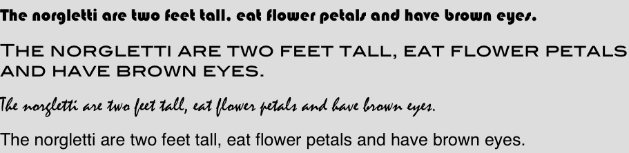
Let’s say I were writing a book about the norgletti, a fictional extraterrestrial species, and had the choice of these four typefaces. If I asked you which one would make your reading experience most pleasurable, the choice would be obvious. The first three fonts are brash, clumsy, juvenile and just plain difficult to read.
What if I didn’t care about the ease with which you flipped through my book, but with the amount of information you retained from it? In that case, the fourth option is actually the worst choice, according to a new study.
Attempting to reconstruct a biological taxonomy lesson, the researchers asked 28 adult volunteers to learn about the norgletti and two other kinds of aliens, each of which had seven features. The participants saw these characteristics listed in either gray, obnoxious Comic Sans MS, or gray, delicate Bodoni MT, or black, clear-as-day Arial font, and had 90 seconds to memorize the lists. They were distracted for 15 minutes, and then tested on their retention with questions such as What color eyes does the norgletti have?
The volunteers who learned the information in Arial answered 73 percent of the questions correctly, whereas those who read it in hard-to-read fonts had 87 percent accuracy. (There was no difference between the two annoying fonts.)
The results have enormous implications for education. But would this font-switching strategy do any good in a real classroom?
In a second experiment, the team changed the fonts of PowerPoint slides and classroom handouts for a variety of classes taken by 222 high school students. For up to a month, some students received the materials in italicized Comic Sans, some in Haettenschweiler and some in Monotype Corsiva — all of which are difficult to read. (In fact, one teacher refused to pass out the materials in Haettenschweiler.)
Students who had received the ugly handouts scored higher on tests of the material than did their peers who had used normal type. This happened in every subject tested — chemistry, English, history and physics.
The researchers propose that when we see an illegible font, our brains have to ramp up their processing power in order to read it. We have to concentrate more, and this helps with memory.
I’m certainly impressed, and already trying to figure out how I can read scientific manuscripts in Comic Sans. I might suggest to other LWONers that we change the blog’s font, too, except I’m afraid of anti-Comic Sans wrath…
 **
**
This research was led by Danny Oppenheimer at Princeton University and appears in the January 2011 issue of Cognition.
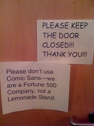
The Comic Sans photo is used with permission from passive-aggressive notes.
I and my fellow graphic designer are crying into our (sans serif) keyboards.
Seems like a pretty flawed and anecdotal study. But the big thing that’s not accounted for here is familiarity. If I looked at the same ugly font every day, it would cease to be a challenge to read.
One could also argue that there are tons of hard-to-read fonts that aren’t ugly, per se. So Comic Sans can still suck it.
Seems to me that the amount of text the subjects were asked to read is a critical factor. An entire page of ugly type would be daunting to read, and would deter all those who haven’t been tasked with reading it all.
Arial and TNR are dull but because they are easier to read, more people are likely to read more information encoded in them.
I don’t find this study to have basis on reality.
The studied gathered adults and gave them a requirement to read. Hence, they were told “here read this.” The subjects all felt that they were needed to read the given materials, and so despite the poor typesetting and poor fonts, they read through everything.
While retention of that material may have been higher when bad fonts were used, this all still hinges on willingness to read. These subjects weren’t given the option of choice. Either they read the material or they don’t participate in the study and presumably don’t get their $50.
In real life, reading is done at our whim. I elected to read this blog post from you, and I did so because it looked easy to read and the subject material was interesting to me. Had you set this in a bad font, I would’ve cursed aloud and closed the window promptly.
Therefore, good typesetting and good font choices are still key to encouraging people to read materials. If your information is perceived as easy to read, people will then be more likely to actually read that information. If you want to turn people away entirely, using poor typography is a good way to go, especially if you think a study supports the idea.
I wonder what percentage of people who don’t bother to read things actually retain the information they didn’t read?
Ryan,
Did you read the entire post? There’s actually a second part of the study, where they used the ugly fonts in real classroom materials, and the children retained more information. Quite provocative implications for education, I think.
To everyone: OF COURSE, ugly fonts are ugly. OF COURSE, ugly fonts are not good for selling things, or designing wedding invitations. OF COURSE, ugly fonts turn people off. Chill out. The findings are interesting for cases in which you’re trying to retain as much information as possible.
This subject has some very valid aspects, even in marketing and sales. You can present the bulk of your message in an appealing font to entice the consumer to read your message. Then present important concepts that you want them to retain in the ugly fonts. The contrast will be striking and engaging, while the ugly font information will be embedded for retention. Could have interesting possibilities for marketers.
Thanks for the insight Virginia!
Should lecturers be annoying, too? Buy loud shirts and add fake accents to our sentences? Great post. Came via http://twitter.com/#!/roseveleth.
It’s interesting to read that Comic Sans was chosen because it’s difficult to read.
In the UK, teachers are encouraged to use Comic Sans because it’s easier to read, especially for weaker readers or younger students, because the ‘a’ appears as it would in handwritten text.
Interesting. But:
1. Seems like they didn’t really control for “ugliness” as opposed to “unusualness,” “difficulty reading,” “difficulty seeing,” or “amount of cognitive processing.”
2. It might be good for rote memory, but more time spent trying to read = less time attempting to understand.
3. 90 seconds may have been enough time to read it all once but not enough time to rehearse it. What if one group spent their time rehearsing while another group struggled to read it once?
4. The difficult font requires a higher minimum level of focus and cognitive processing… what if the same level of focus had instead been applied to understanding? For example, participants could be asked to consider meaning or semantic associations.
As a teacher, I find this study very interesting. As the teacher from the UK pointed out, I also always use Comic Sans for my beginning readers because the letters are formed similarly to how I’m teaching them to write.
I am also interested in a study would compare students with varying exceptionalities- dyslexia, visual processing disorders, etc. I wonder if the results would still be the same or if the opposite would be found. Some students have such difficulties reading standard fonts that making the font more difficult to read might make it impossible to retain any information at all. If it takes several minutes to figure out what a word says, you tend to forget what the previous word even was (something I’ve consistently observed in struggling readers).
On a different note, I wonder if it would still be an effective technique if used in power point- I think it would depend on the length of time the slide was shown. Some presenters flash through slides barely giving you time to read what they say, while others leave them up for minutes.